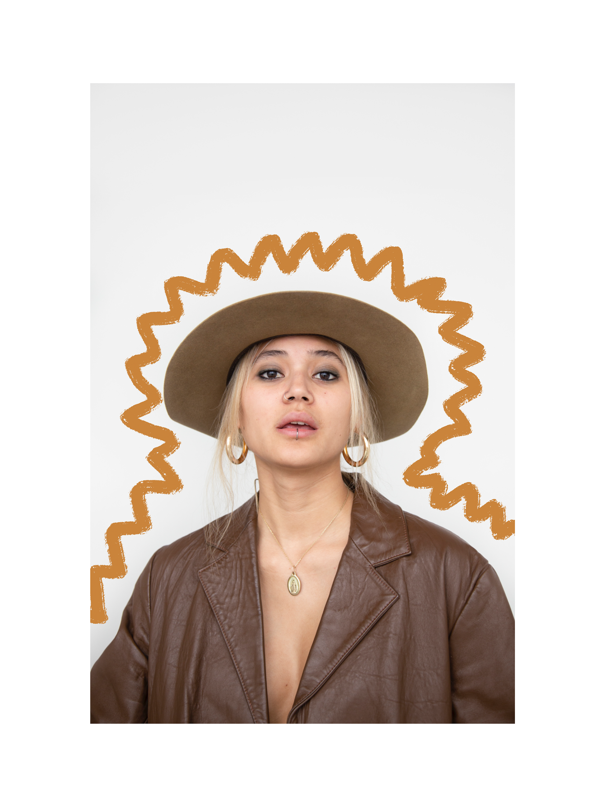
To start off my editing process, I used Adobe Sketch. I tried out numerous brushes, such as; pastel, acrylic and chalk.
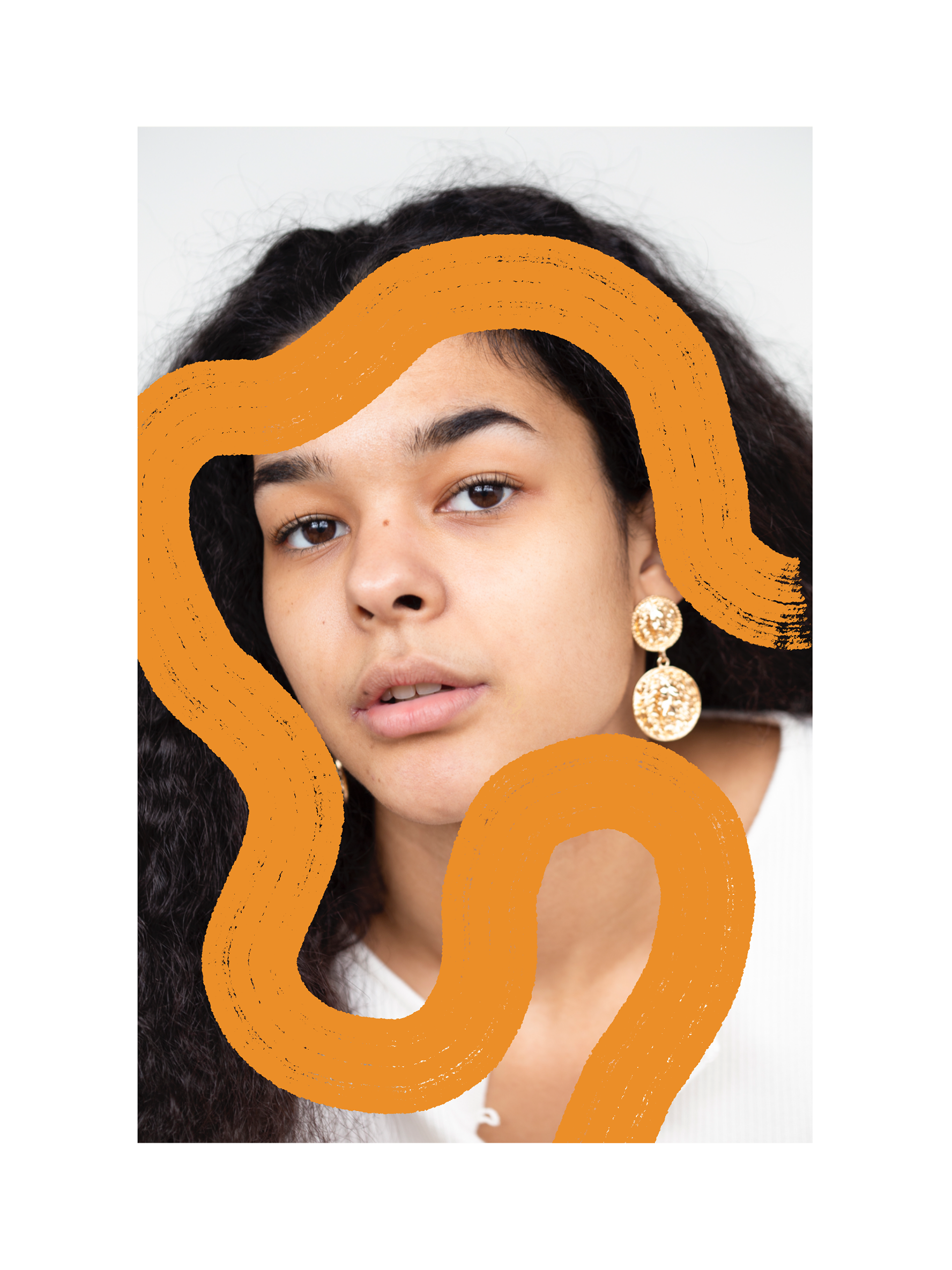
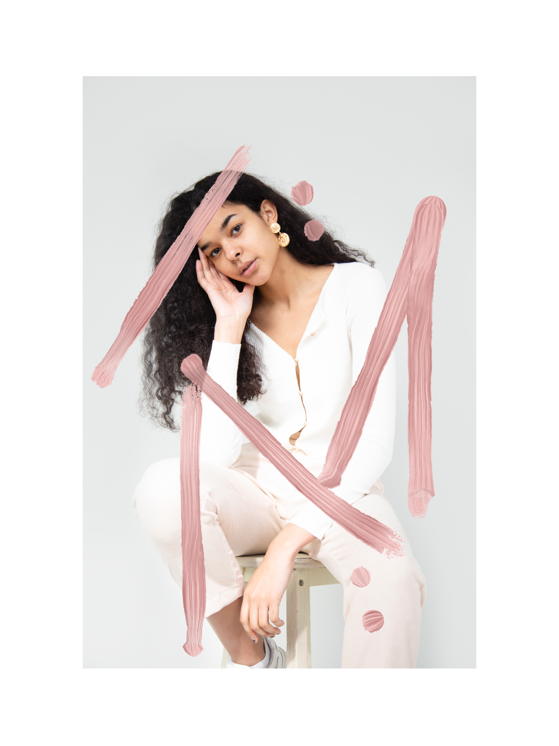
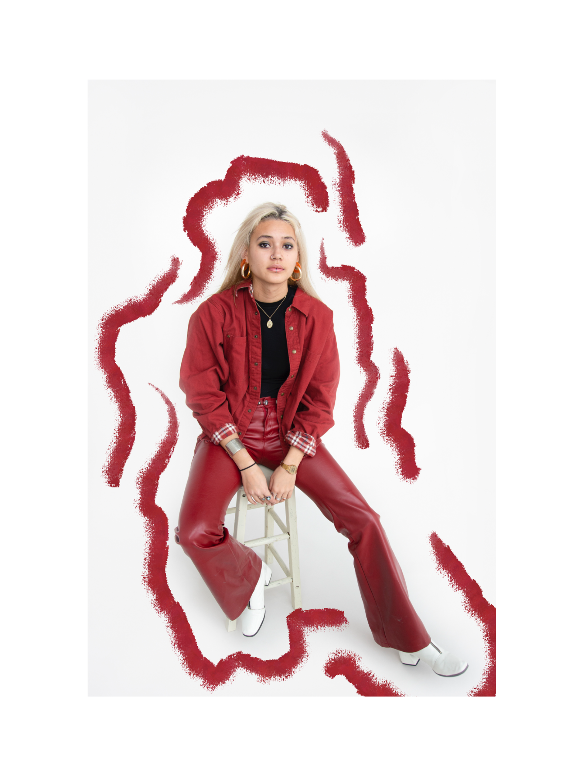
I started with very flowy brushstrokes, to try and make it as free as possible. However, I found that it was still a little too considered, and gave the images a look that I did not really like.
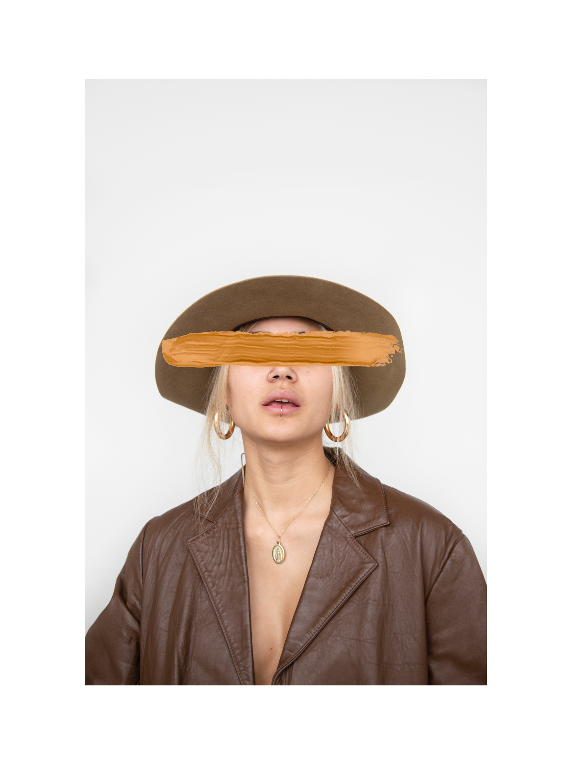
I started to think about the colours I was using, and tried to find colours that I thought were complimentary to those in the photograph.
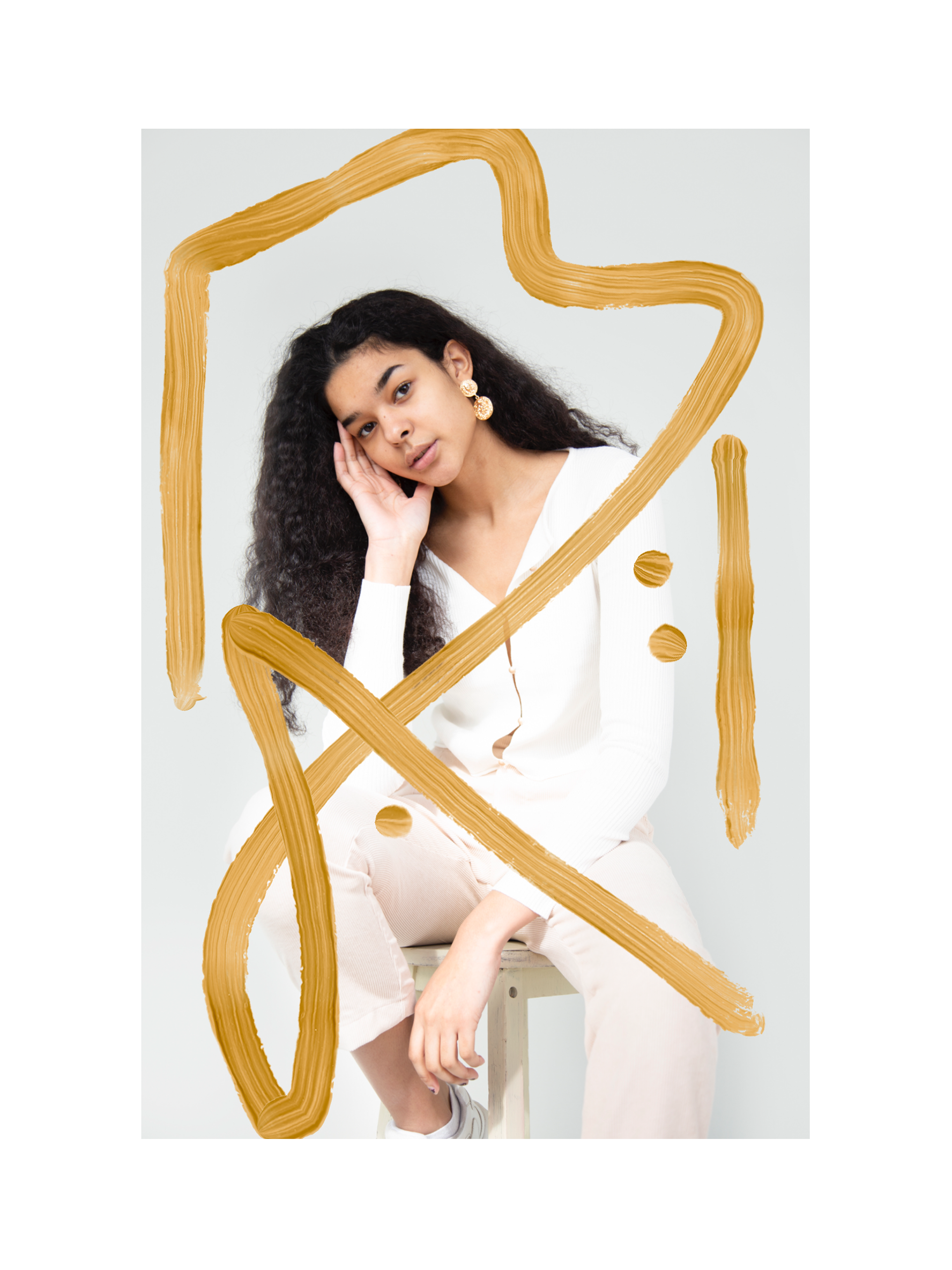
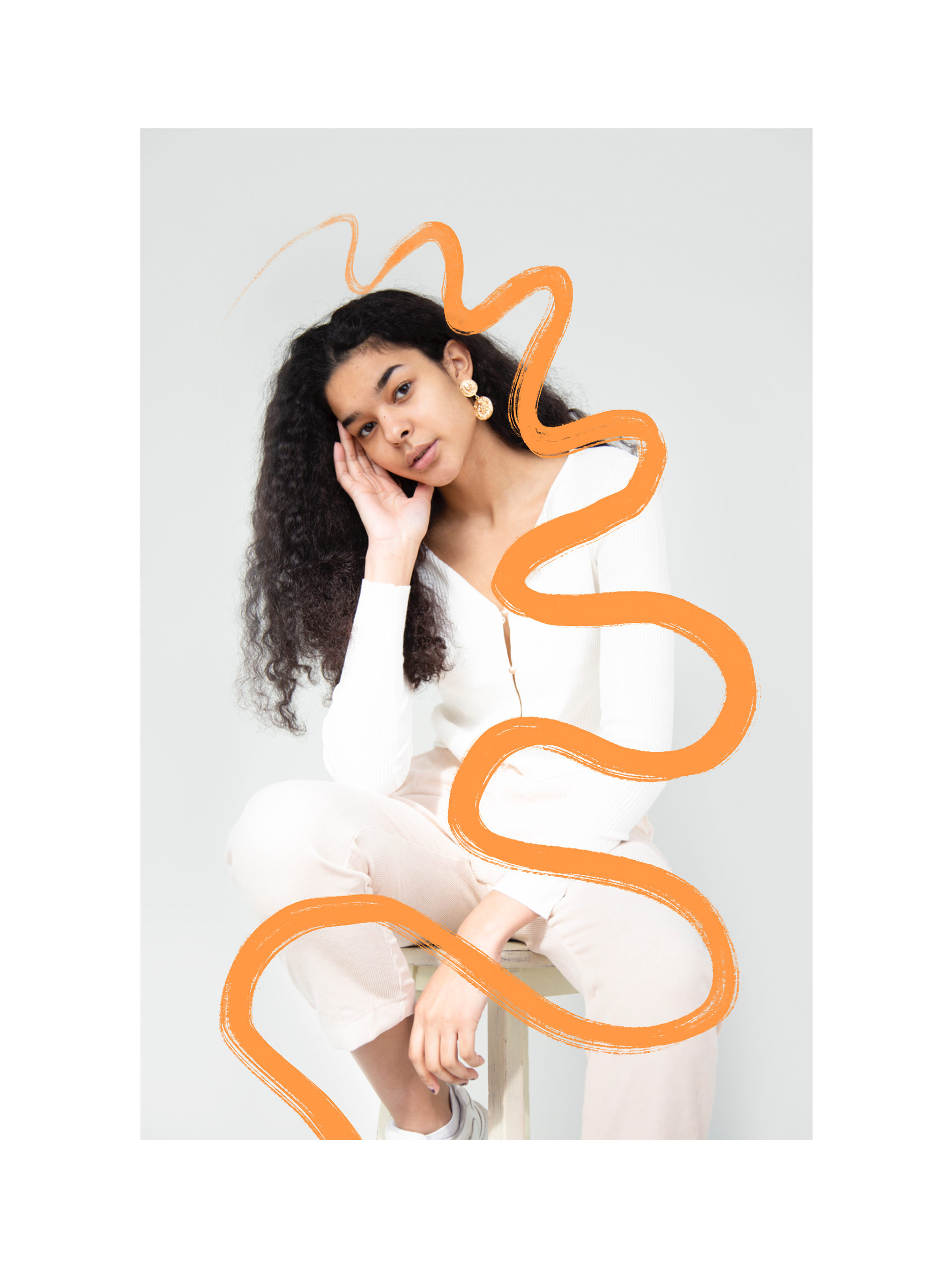
I then started to look at creating more considered brushstrokes that gave the images a bit more design to them, however, again I found that this was too considered and pretty for my images.
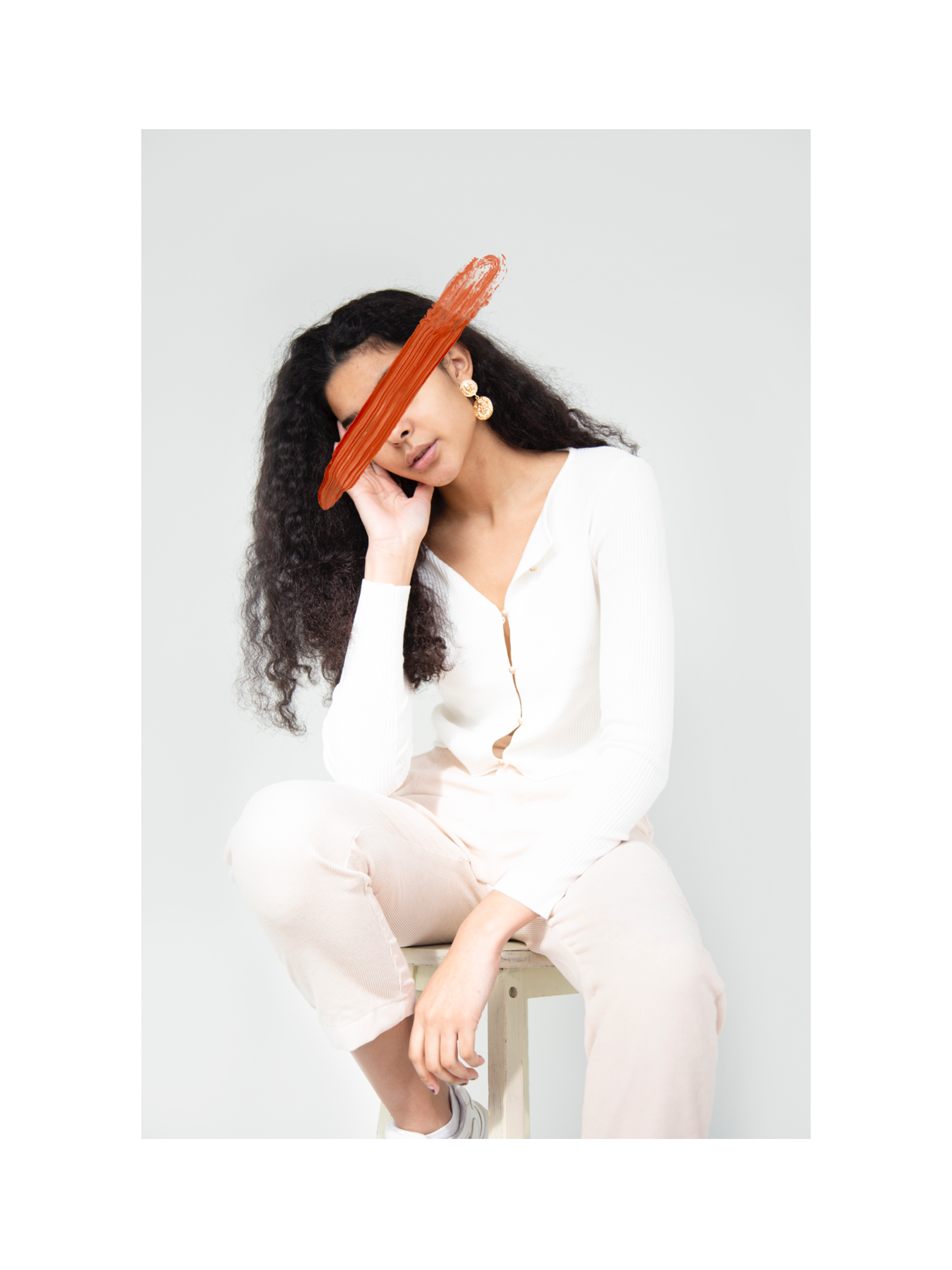
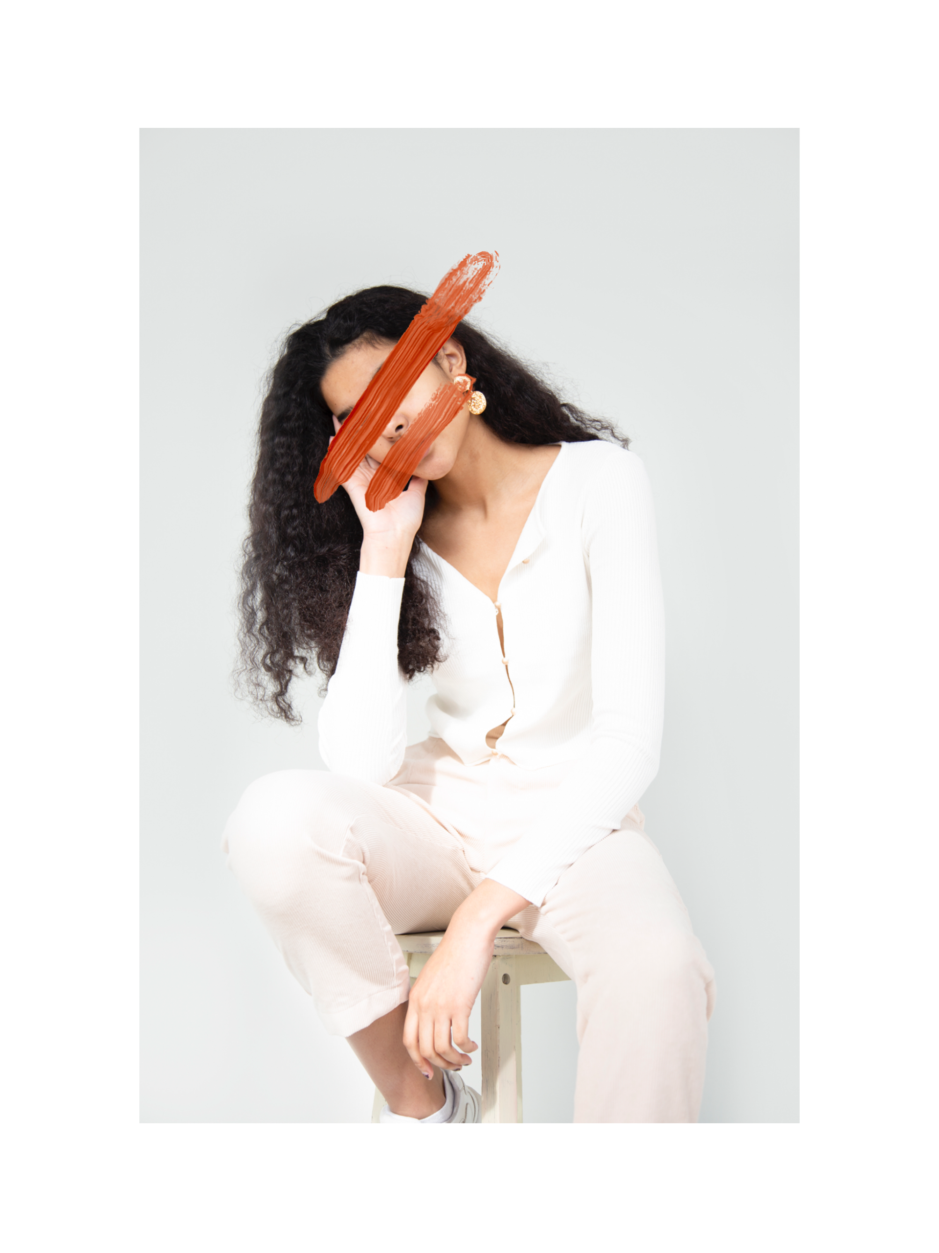
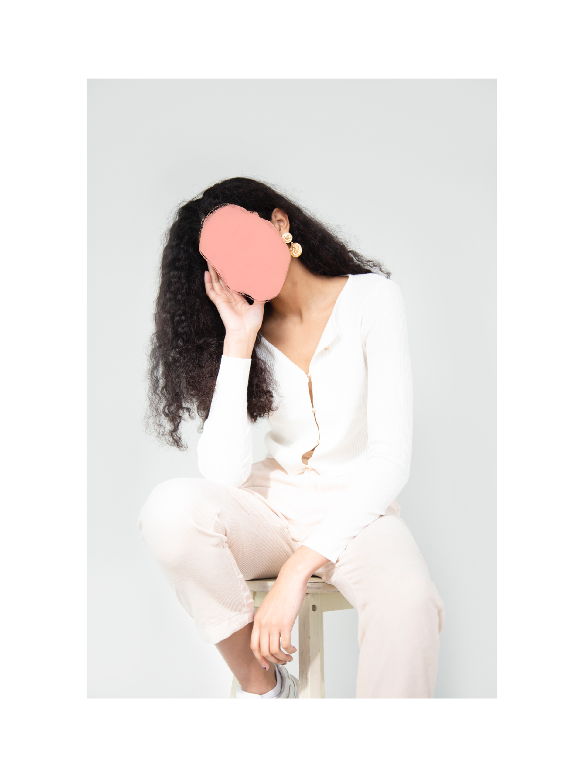
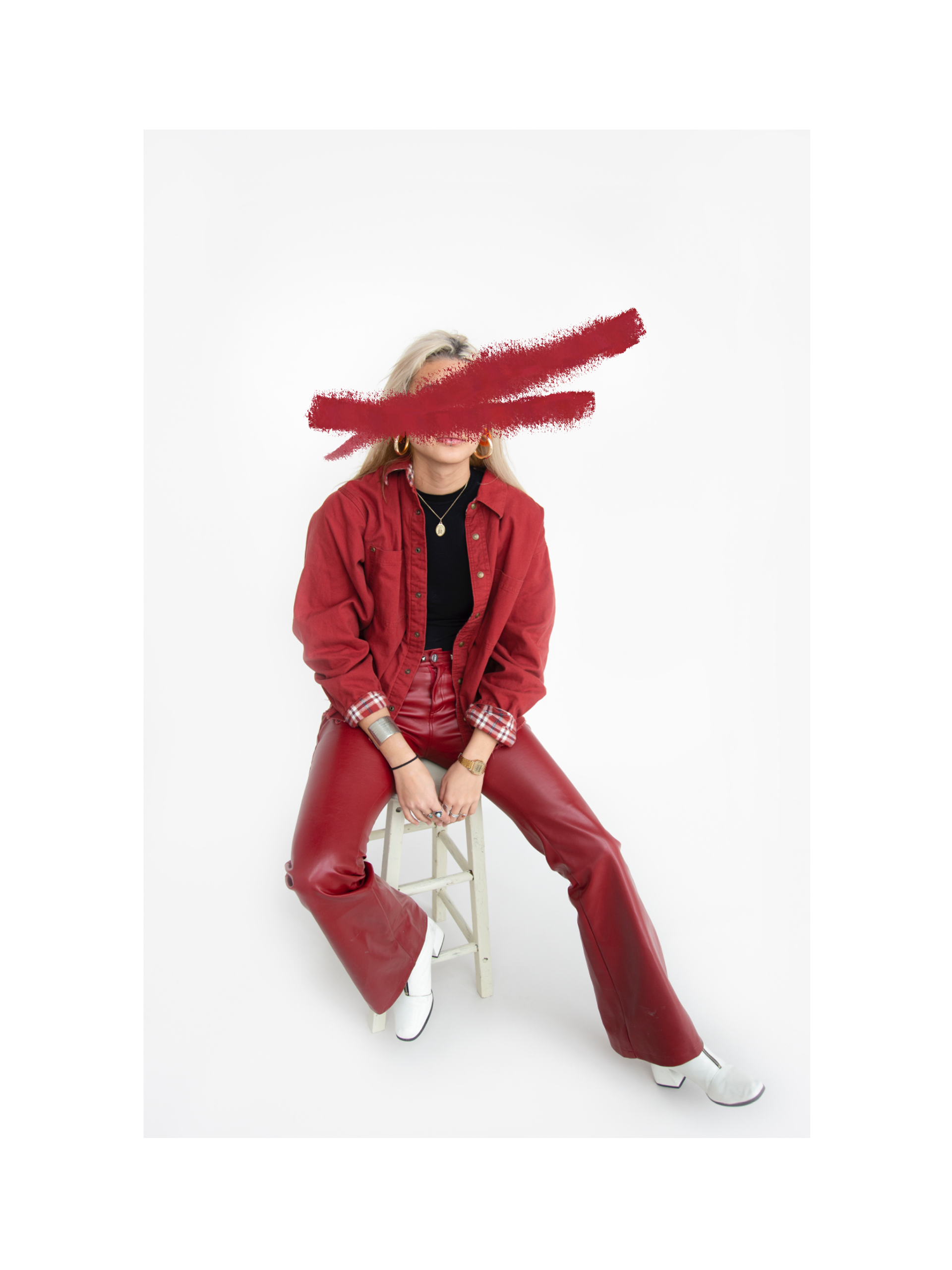
I then looked at ways in which I could cover her face and tried to find contrasting colours to see if that was more effective than the complimentary colours. However, I found that if I did it with contrasting colours, there was no sense of connection between the two.
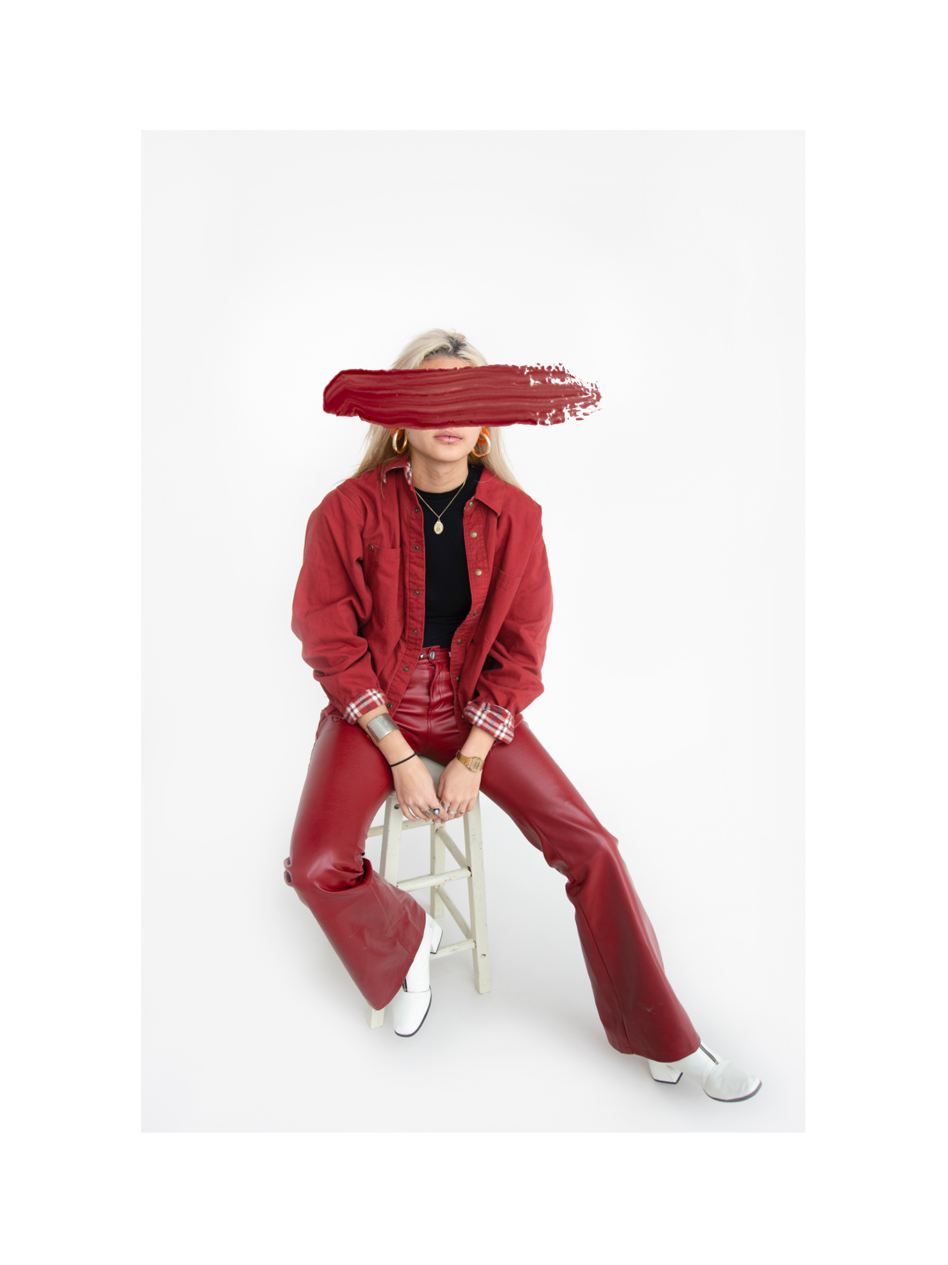
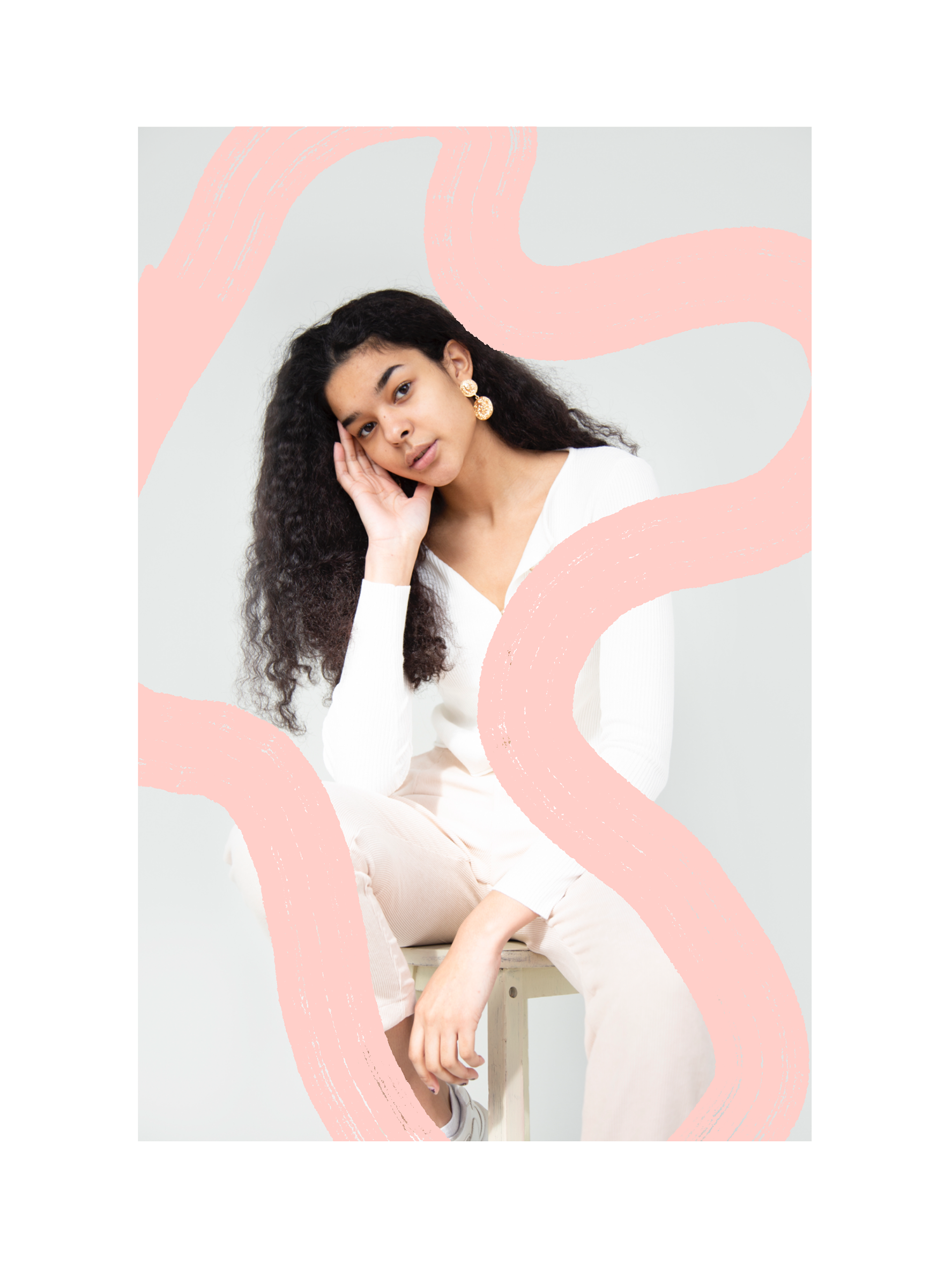
I then decided that the best way to choose the paintbrush colours, was by sourcing the colours within the photograph. I used the colour dropper tool to locate the colours, which gave me the opportunity to find colours that would harmonise with the image.
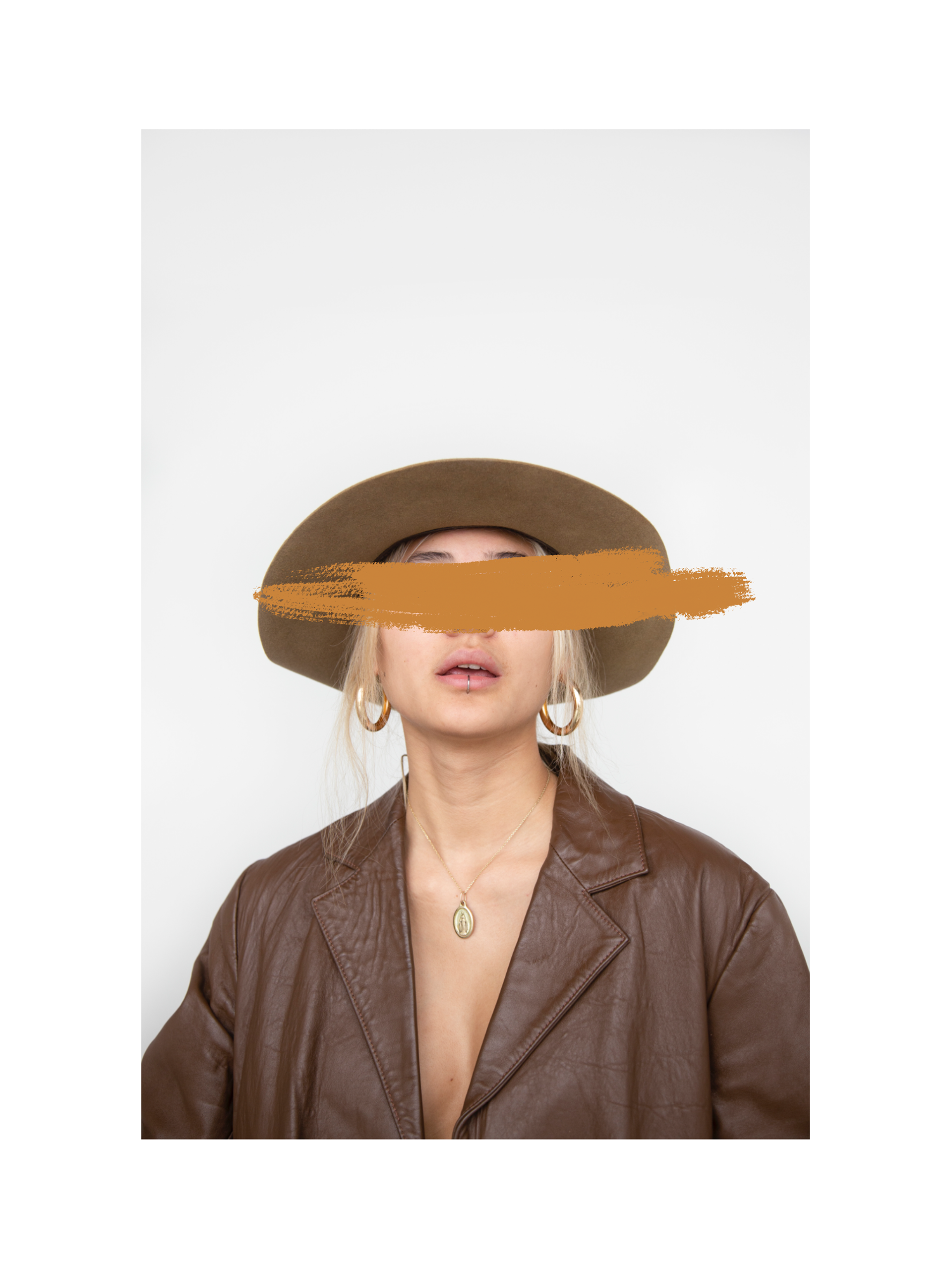
I finally tried a little more of the digital editing, however, I felt that all of my images looked far too considered and neat, and if I really wanted to ruin the images, then I was going to have to do it physically.