I then attempted to burn the images because I felt as though it was quite a destructive process to explore. I had to try a lot of different processes to be able to perfect it, ranging from using card to using photographic paper.

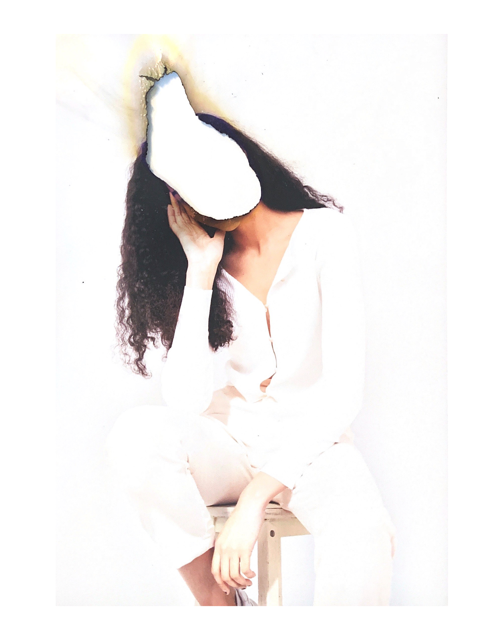
I started off using photographic paper and laying the image on top of white paper. The image on the left was scanned on a printer and the one on the right was scanned using my phone. I found that the scanning with the printer was a lot less effective than that of my phone, as it created more grain and less definition. While I didn't mind the white background, I found it a little boring and felt as though something was missing.
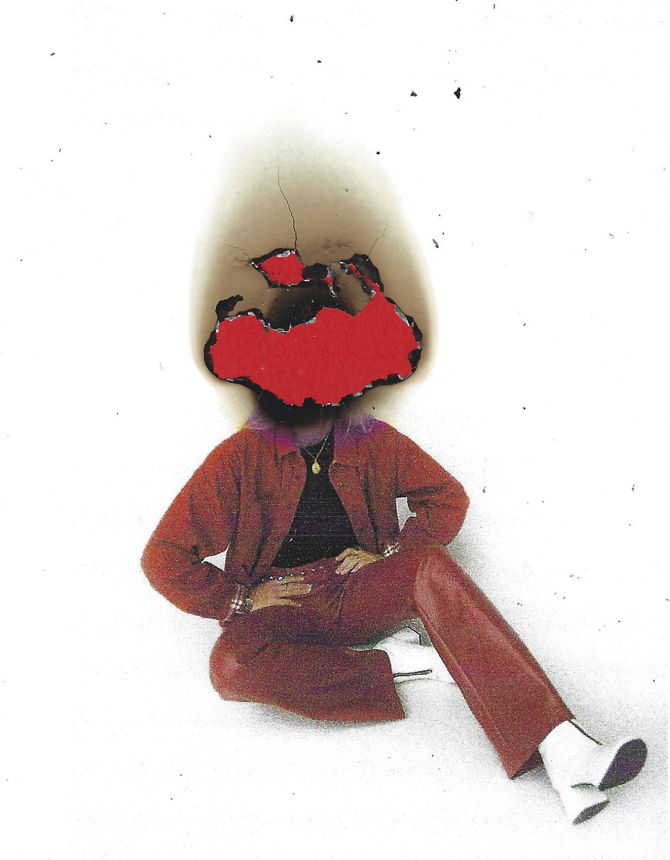

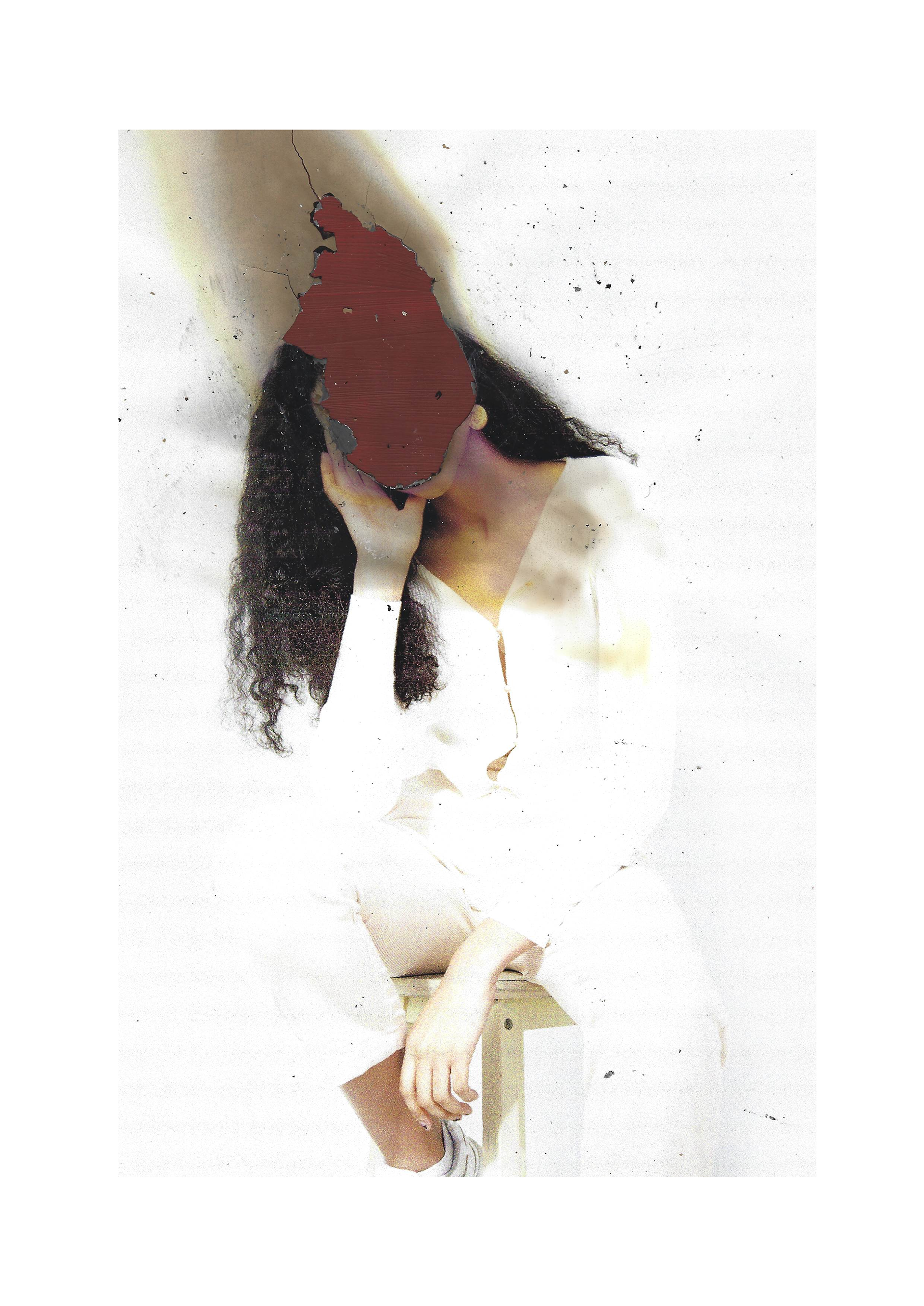
I then attempted layering the burned photograph on top of red paper. The first image on the left was done with a red sheet of paper - however, I felt as though it was too bright and didn't look good with the image. I wanted to try and create a red that was a little darker in tone and went better with the colours within the photograph. In the middle and right image, I painted a sheet of paper with a deep red colour and layered the image on top of it. While I felt as though this looked better - I decided that the solid colour was a little dull and made the actual image too dark, bringing down the brightness altogether.
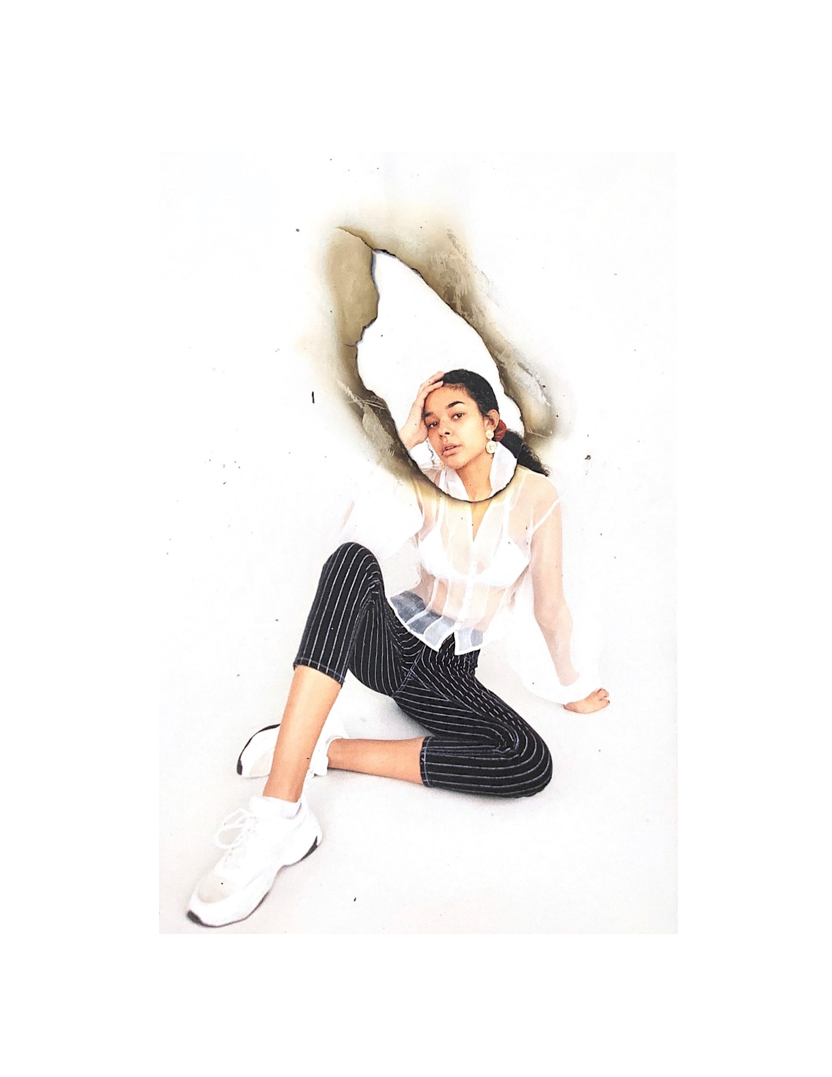
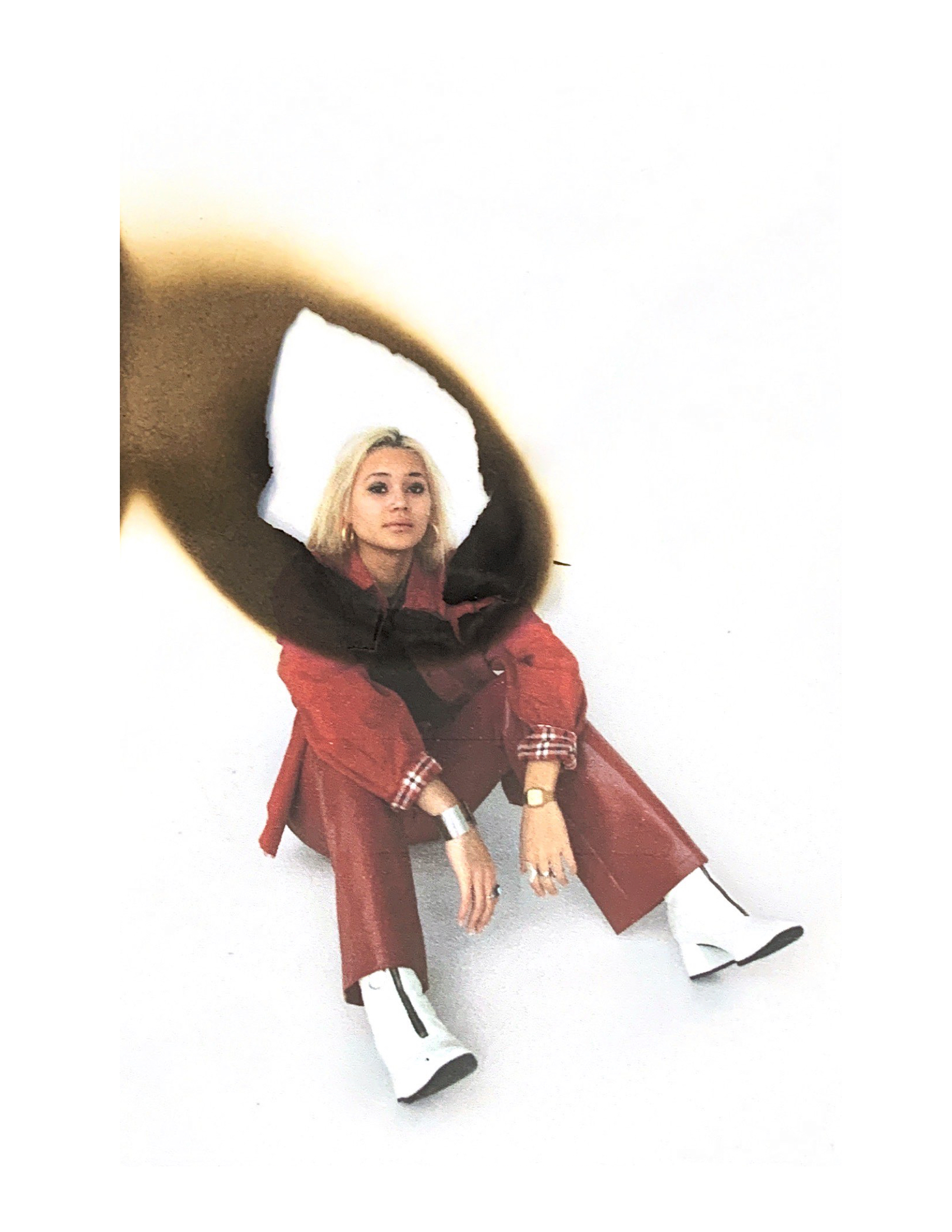
I then moved on to layering the original image underneath the burnt image. While I felt as though this was much more effective, I decided that I had to make the burns themselves a lot smaller - and instead have them frame the face than lead off of the page.
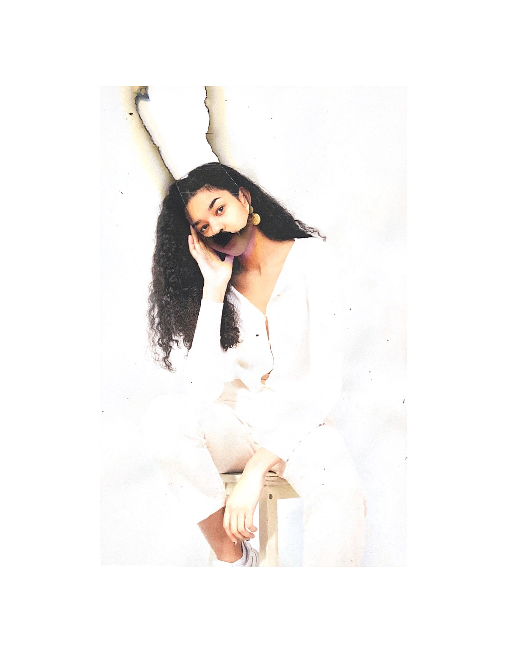
While I felt as though I was getting better at the burning, I decided that this went in the opposite direction and looked too small.

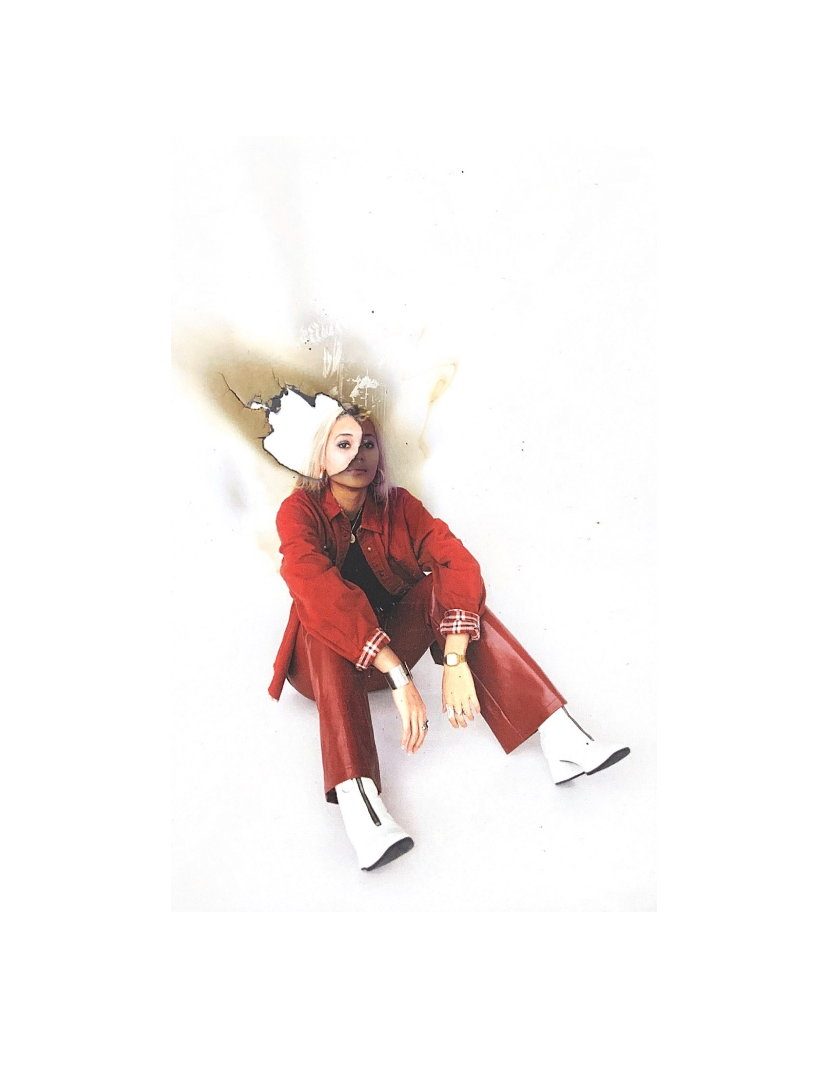
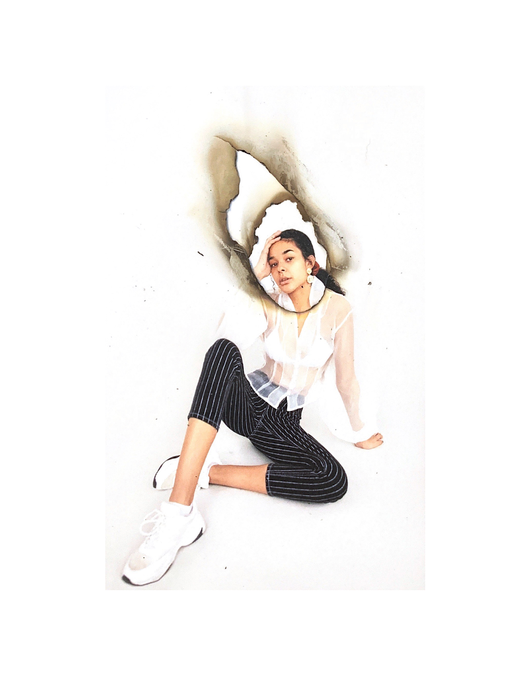
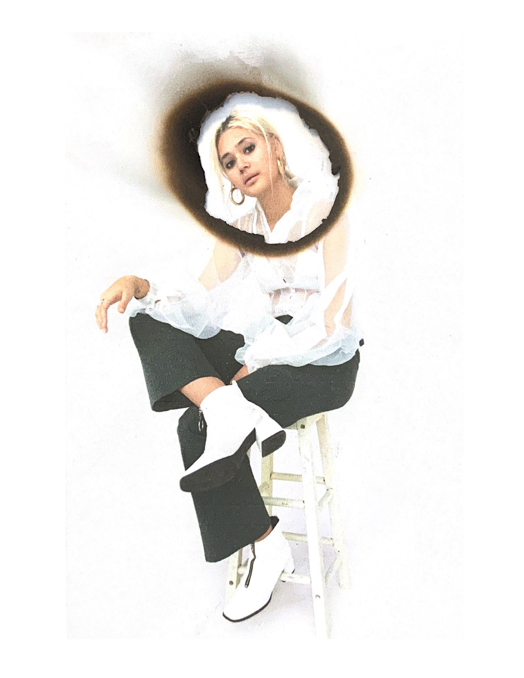
I felt as though I was starting to hone in more on what I would like the images to look like. I thought that the one on the left was still slightly too large and the one on the right had a bit too much burning around the hole - making it look a little too dirty.
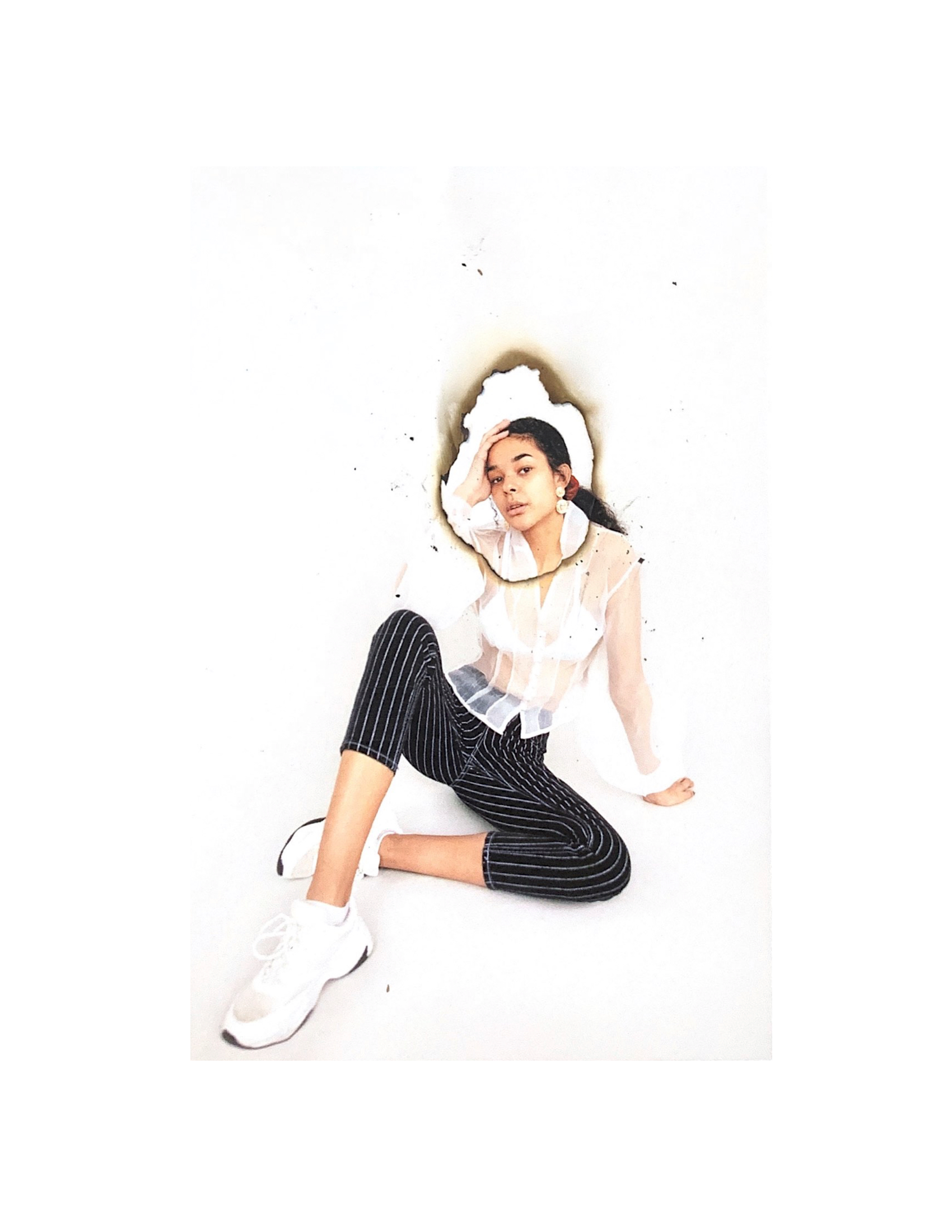
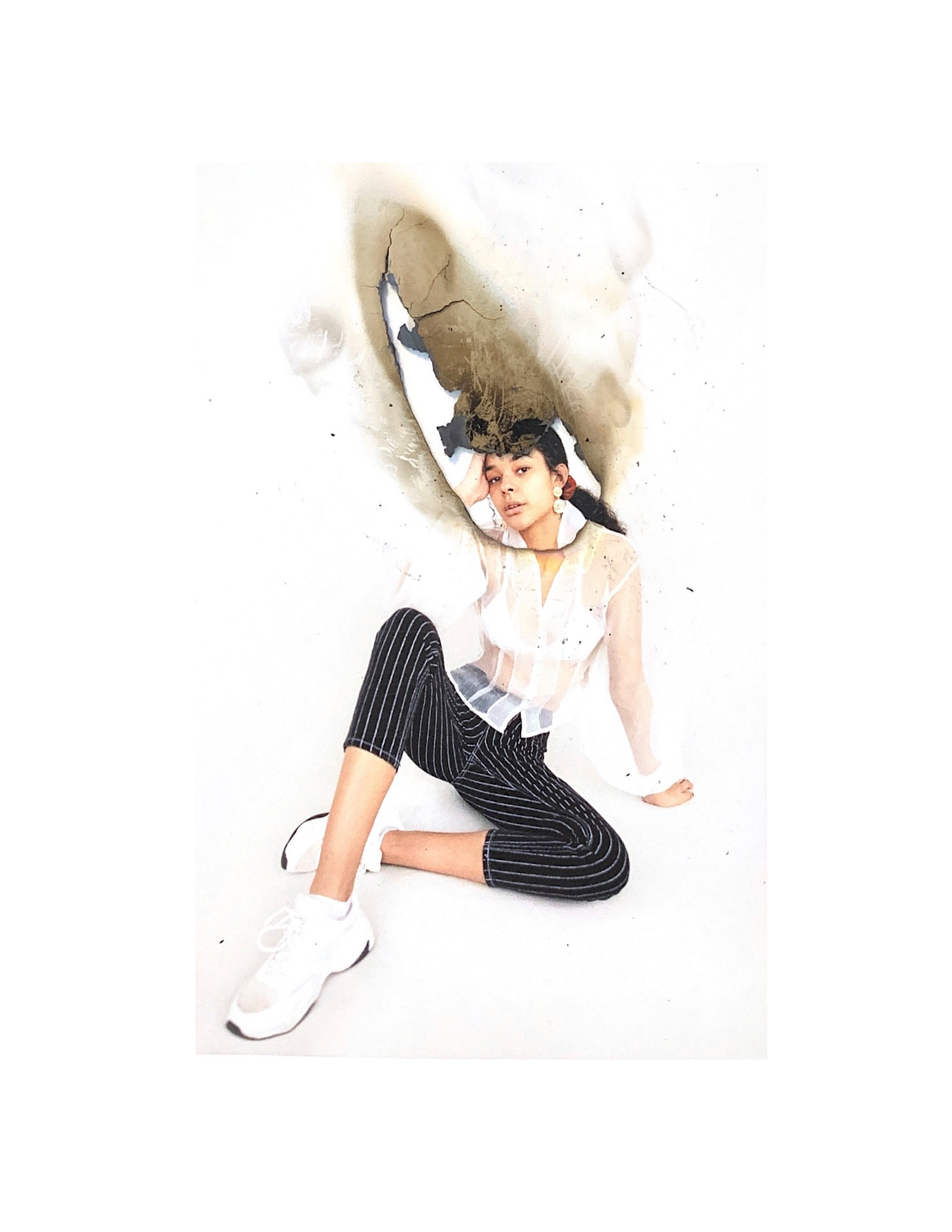
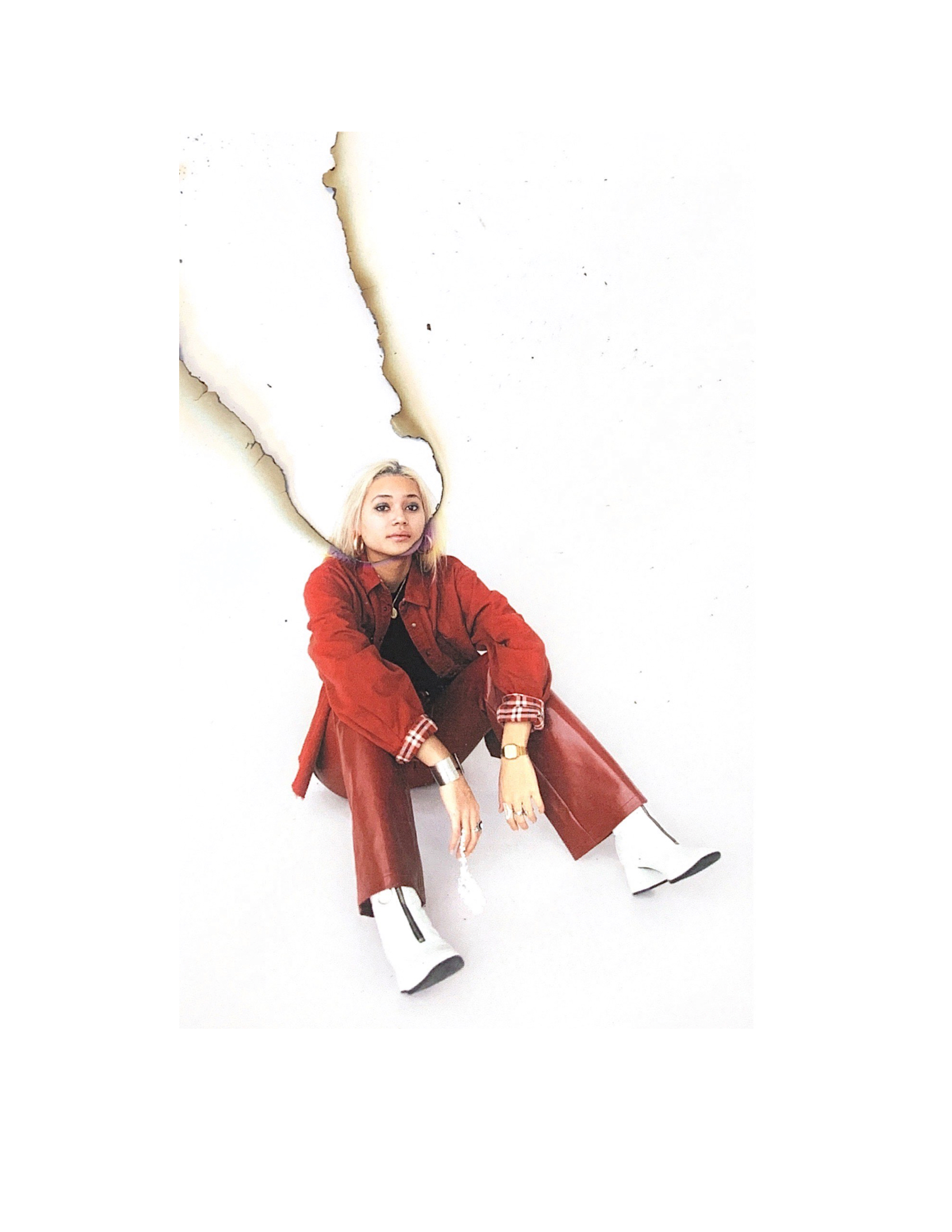
After a lot of trial and error, I felt as though this burn was the perfect size. It framed the face very well and wasn't too distracting in nature. I thought that this technique was really effective and was quite unique.

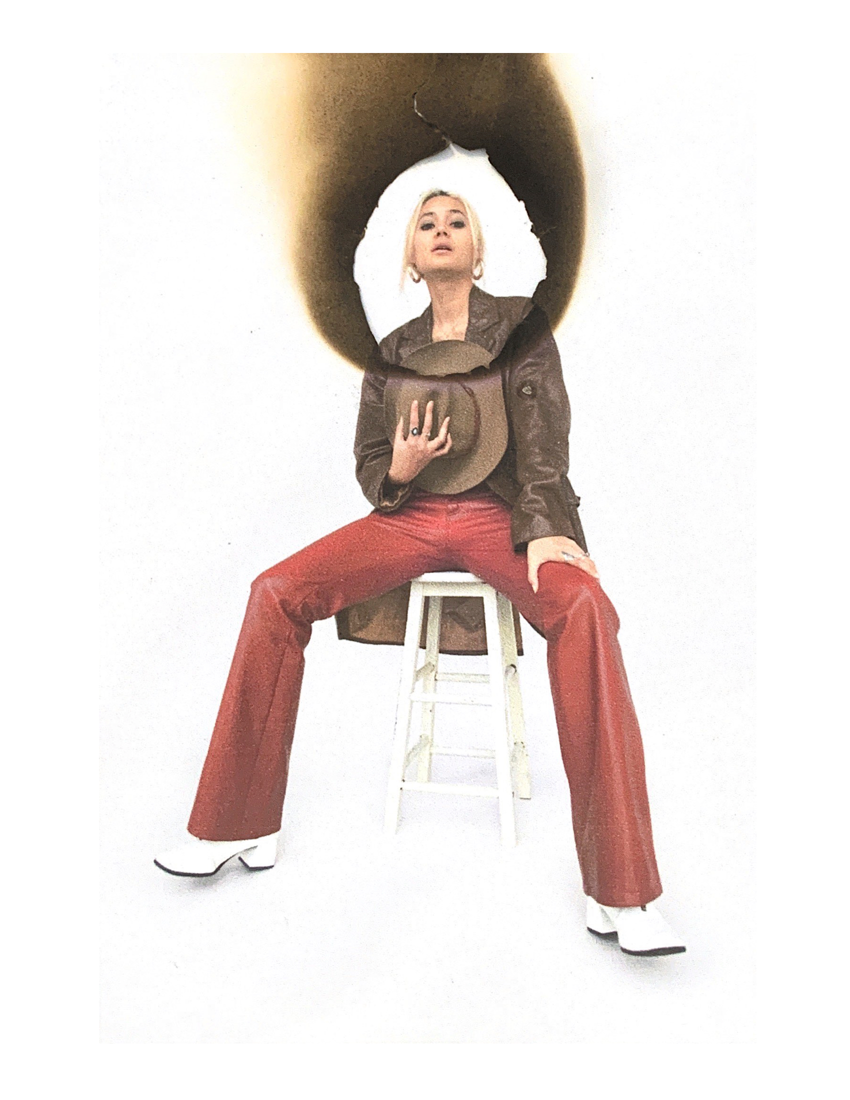
I then attempted layering the burns on top of the original image - however, I thought it started to look too busy and cluttered.
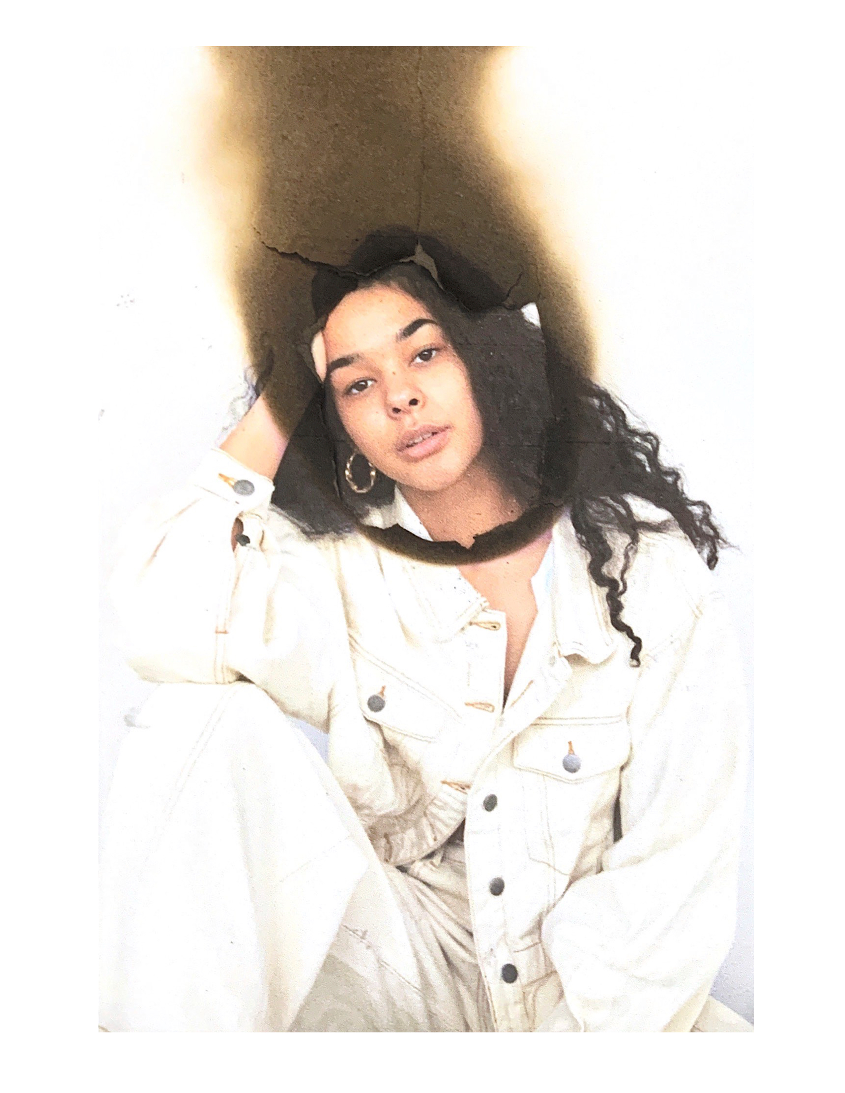
I then made the mistake of trying card as opposed to photographic paper, because I felt that it might create a different burn effect and maybe give more defined lines - however, I found that it burnt the paper too much and started to look messy.


I tried a couple more to see if a slightly different approach would make it look any better, but no matter how many times I tried it, the card just did not work better than the photographic paper.